Development version
This is the latest (dev) documentation. It may contain unreleased features or breaking changes. For the stable release, use stable.
Plotting Gallery
sklearn-genetic-opt ships diagnostic plot functions that read the metadata stored on a fitted search. This gallery runs one real search and then draws every public plot helper against it, so each figure below is produced by the exact code shown. Use it to answer the main post-search questions: what was trained, how it converged, how diverse the population stayed, what decisions the optimizer made, and whether robust solutions were found.
Setup: One Search to Plot
We tune a RandomForestClassifier on the breast-cancer dataset with several hyperparameters of mixed type (integers, a continuous fraction, and two categoricals). Diversity control, fitness sharing, and local search are enabled so the diversity, optimizer-event, and decision plots actually have something to show. The run is small (population 12 x 10 generations) so the whole gallery builds in well under a minute.
import warnings

import matplotlib.pyplot as plt
import numpy as np
import pandas as pd
from sklearn.datasets import load_breast_cancer
from sklearn.ensemble import RandomForestClassifier
from sklearn.model_selection import StratifiedKFold, train_test_split

from sklearn_genetic import (
    EvolutionConfig,
    GASearchCV,
    OptimizationConfig,
    PopulationConfig,
    RuntimeConfig,
)
from sklearn_genetic.plots import (
    SearchPlotter,
    plot_candidate_rankings,
    plot_convergence,
    plot_cv_scores,
    plot_diversity,
    plot_fitness_evolution,
    plot_history,
    plot_optimizer_events,
    plot_parameter_evolution,
    plot_search_decisions,
    plot_search_overview,
    plot_search_space,
    plot_score_landscape,
)
from sklearn_genetic.space import Categorical, Continuous, Integer

warnings.filterwarnings("ignore")
RANDOM_STATE = 42

X, y = load_breast_cancer(return_X_y=True)
X_train, X_test, y_train, y_test = train_test_split(
    X, y, test_size=0.25, stratify=y, random_state=42
)
cv = StratifiedKFold(n_splits=3, shuffle=True, random_state=42)

search = GASearchCV(
    estimator=RandomForestClassifier(random_state=42, n_jobs=1),
    random_state=RANDOM_STATE,
    cv=cv,
    scoring="roc_auc",
    param_grid={
        "n_estimators": Integer(30, 90),
        "max_depth": Integer(2, 16),
        "min_samples_split": Integer(2, 24),
        "max_features": Continuous(0.2, 1.0),
        "criterion": Categorical(["gini", "entropy"]),
        "class_weight": Categorical([None, "balanced"]),
    },
    evolution_config=EvolutionConfig(
        population_size=10,
        generations=10,
        crossover_probability=0.9,
        mutation_probability=0.1,
        elitism=True,
        keep_top_k=4,
    ),
    population_config=PopulationConfig(initializer="random"),
    runtime_config=RuntimeConfig(n_jobs=1, use_cache=True, verbose=False),
    optimization_config=OptimizationConfig(
        diversity_control=True,
        fitness_sharing=True,
        local_search=True,
        local_search_top_k=2,
    ),
)

search.fit(X_train, y_train)
print("Best CV ROC AUC:", round(search.best_score_, 4))
print("Best params :", search.best_params_)Best CV ROC AUC: 0.9894
Best params : {'n_estimators': 62, 'max_depth': 10, 'min_samples_split': 4, 'max_features': 0.2825358714597836, 'criterion': 'entropy', 'class_weight': None}Overview Dashboard
plot_search_overview is the fastest way to inspect a fitted search. It packs convergence, diversity, optimizer events, and the strongest candidates into a single 2x2 figure.
plot_search_overview(search, top_k=6)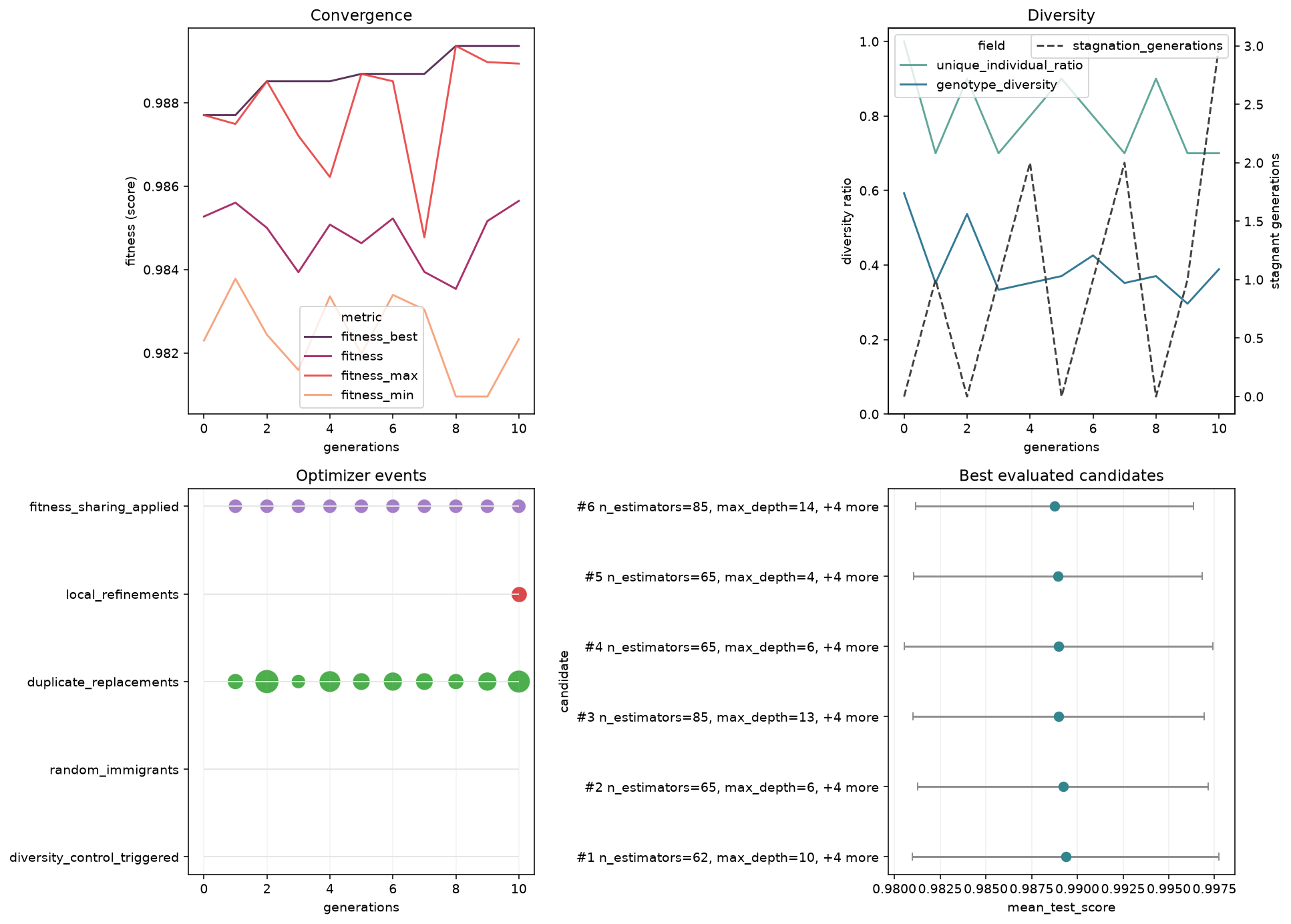
Four diagnostics at a glance: convergence (top-left), diversity (top-right), optimizer events (bottom-left), and the best evaluated candidates (bottom-right).
What to look for: a rising best-fitness curve that flattens (converged), diversity that stays above zero (no premature collapse), and a tight cluster of strong candidates at the top of the ranking panel.
You can also keep a fitted search wrapped in a small plotting facade and call the same plots as methods:
plotter = SearchPlotter(search)
type(plotter).__name__'SearchPlotter'Fitness Evolution
plot_fitness_evolution shows how a fitness metric changes across generations.
plot_fitness_evolution(search)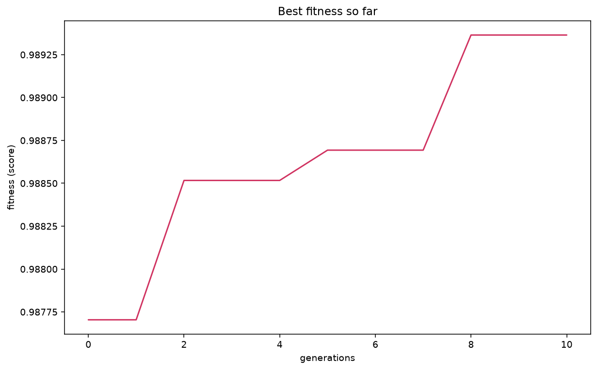
Best-so-far ROC AUC climbing across generations.
Plot several metrics together with light smoothing:
plot_fitness_evolution(
    search,
    metrics=["fitness_best", "fitness", "fitness_max"],
    window=2,
    kind="line",
    title="Fitness comparison with smoothing",
)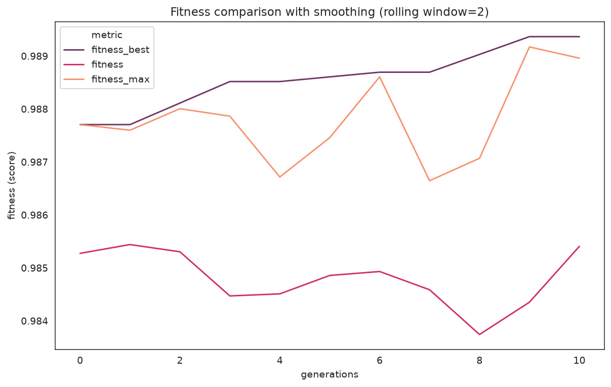
best vs. population mean vs. per-generation max, smoothed with a window of 2.
What to look for: the gap between fitness_best and fitness (mean) is the population's spread. A mean that races up to meet the best can signal the population converging — cross-check with the diversity plot below.
| Parameter | Description |
|---|---|
metric / metrics | One field, or a list of history fields to overlay |
window | Rolling-average window (default: no smoothing) |
kind | "line", "bar", "area", or "step" |
title | Chart title |
History and Decisions
plot_history plots any fields from history (generation stats) or logbook (per-candidate evaluations).
plot_history(
    search,
    fields=["fitness_best", "fitness", "unique_individual_ratio", "genotype_diversity"],
    kind="line",
    subplots=True,
    title="Optimizer history overview",
)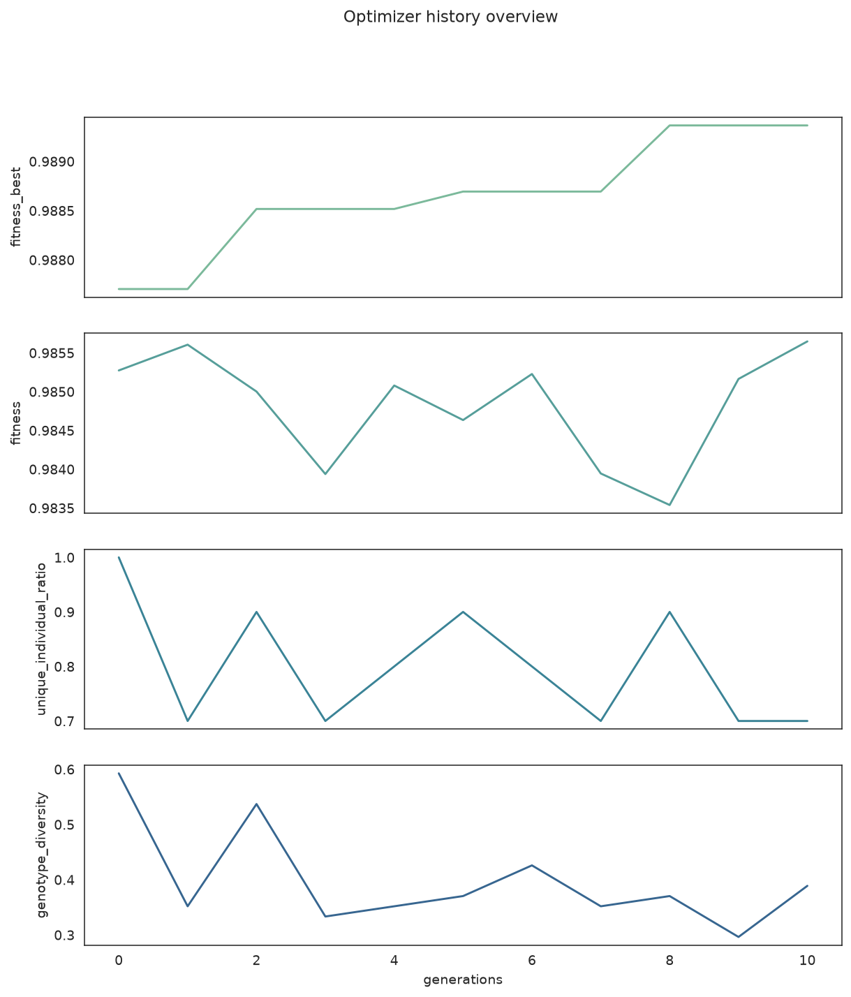
Fitness and diversity telemetry, one field per subplot.
plot_search_decisions focuses only on the optimizer-control fields (mutation probability, selection pressure, immigrants, local refinements, ...) as a stack of step plots.
plot_search_decisions(search)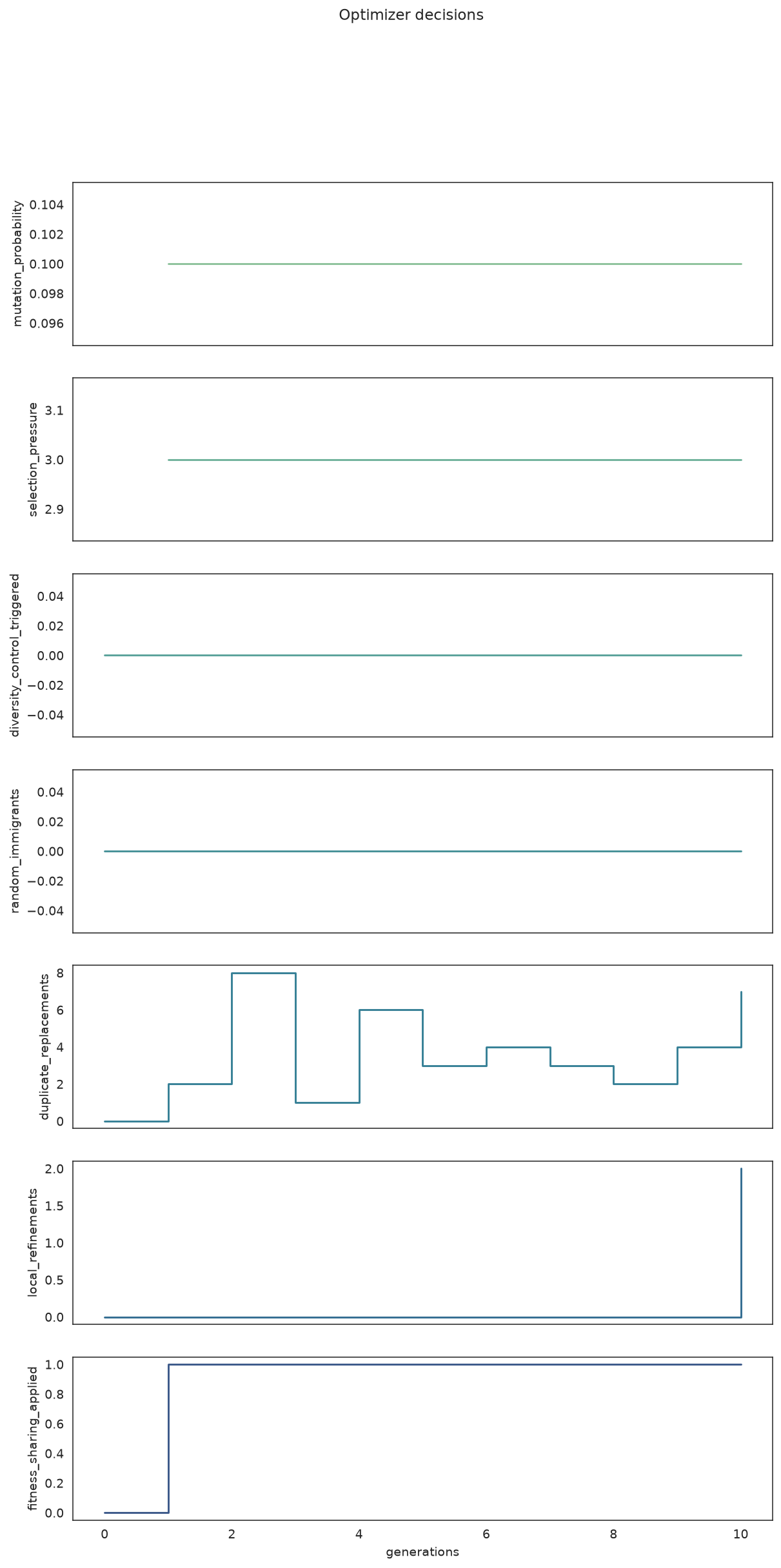
When the optimizer adjusted mutation, injected random immigrants, or ran local refinements.
What to look for: spikes in random_immigrants or duplicate_replacements mean diversity control kicked in; steps in mutation_probability show an adaptive schedule responding to stagnation.
Focused Convergence and Diversity
When you want one figure per question instead of the dashboard:
plot_convergence(search)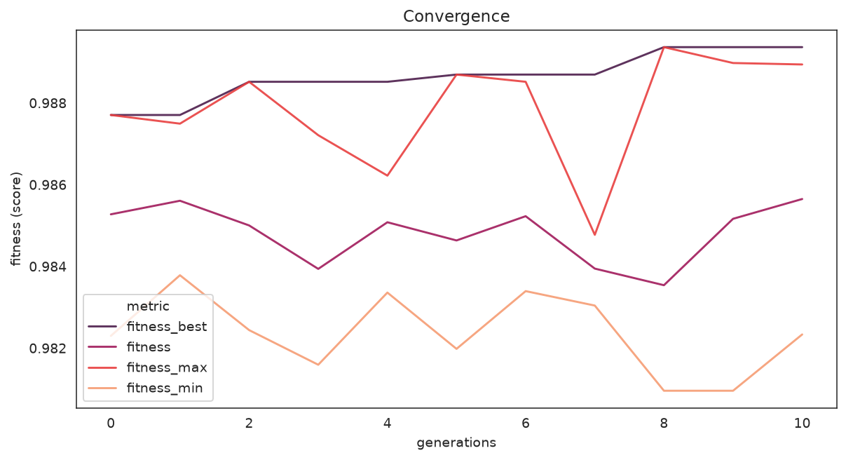
Best, mean, max, and min fitness on a single axis.
What to look for: the spread between max and min narrowing over time is healthy convergence; a flat-from-the-start best curve suggests the search space was too easy or too small.
plot_diversity(search)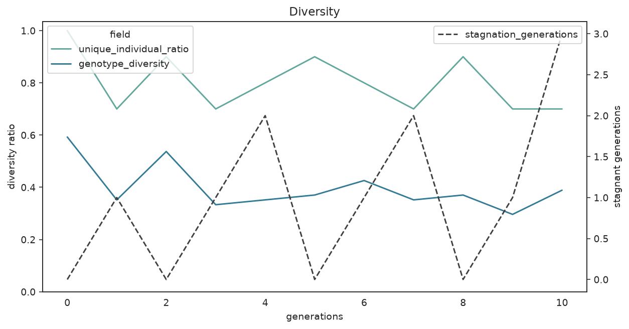
Unique-individual ratio and genotype diversity; stagnant generations on the right axis.
What to look for: if diversity collapses toward zero early and stagnation climbs, the population has converged prematurely — enable fitness_sharing, raise random_immigrants_fraction, or lower diversity_threshold before simply adding generations.
Search-Space Exploration
plot_search_space shows how the sampled parameters relate. The pair plot colors points by a categorical column when hue is set.
plot_search_space(
    search,
    features=["n_estimators", "max_depth", "min_samples_split", "max_features"],
    kind="pair",
)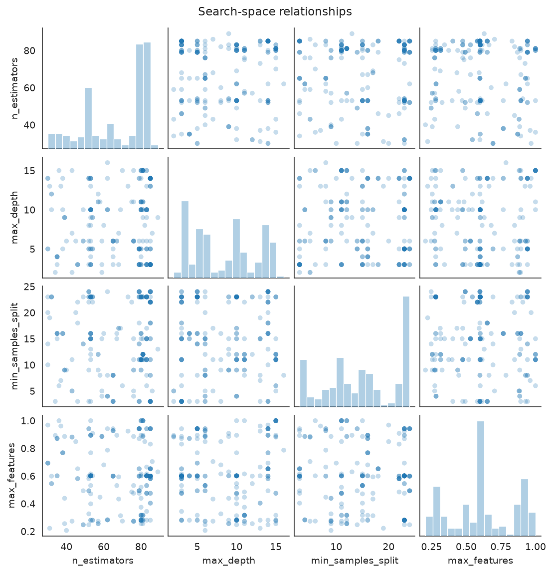
Pairwise scatter of the numeric parameters the search actually sampled.
A correlation heatmap is a compact alternative for numeric parameters:
plot_search_space(
    search,
    features=["n_estimators", "max_depth", "min_samples_split", "max_features"],
    kind="heatmap",
)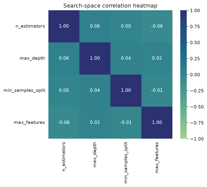
Correlations between sampled parameters and the score.
What to look for: clusters of sampled points reveal where the optimizer concentrated its effort; a strong correlation in the heatmap hints at a parameter that drove the score.
| Parameter | Description |
|---|---|
features | Parameter names to include (omit for all numeric params) |
hue | Categorical column for color coding (pair plot only) |
kind | "pair" or "heatmap" |
Parameter Exploration Over Time
plot_parameter_evolution plots each parameter's sampled value in evaluation order, colored by the score, so you can see whether strong candidates clustered in a narrow range.
plot_parameter_evolution(
    search,
    parameters=["n_estimators", "max_depth", "min_samples_split"],
)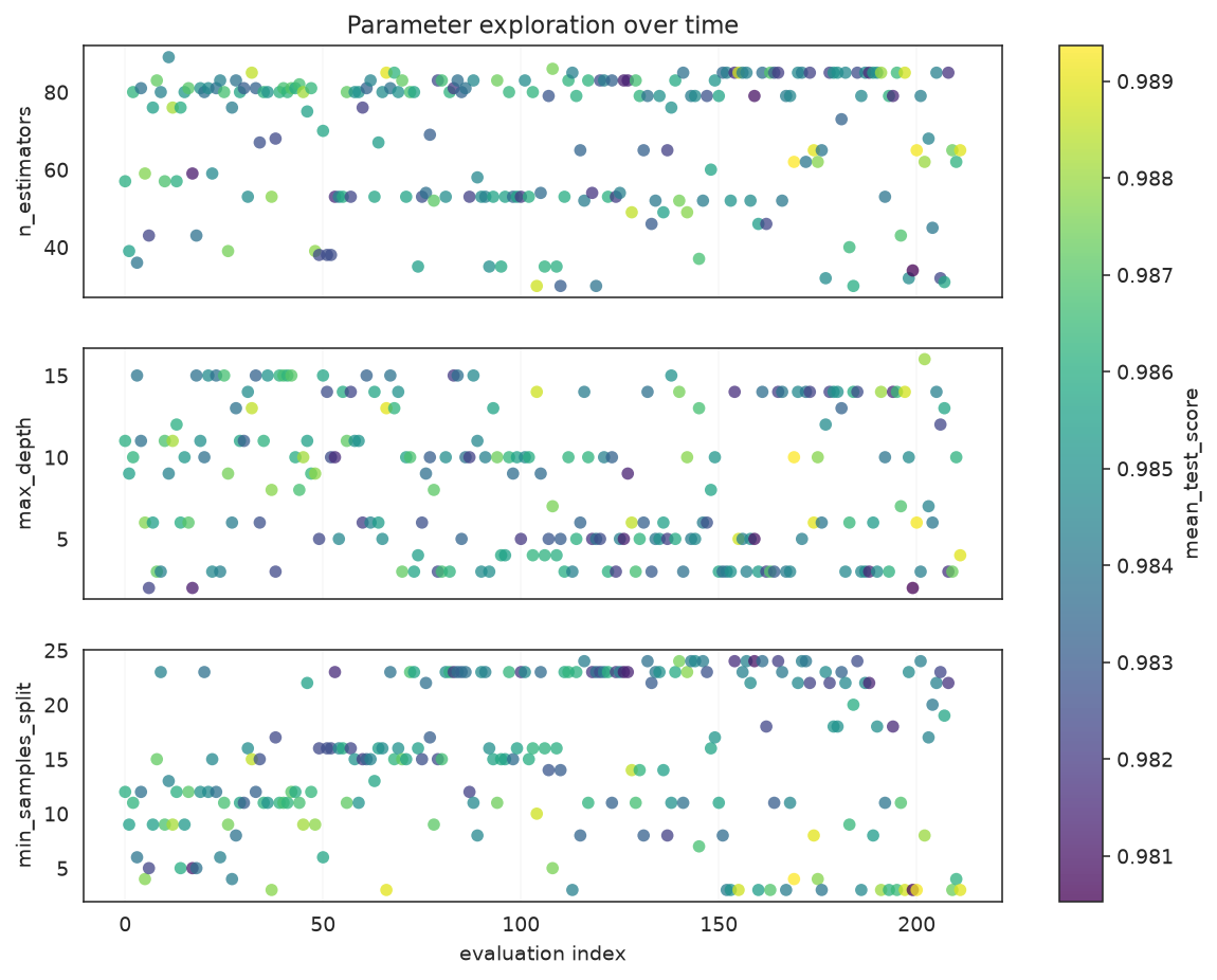
Each parameter's sampled value over evaluation order; brighter points scored higher.
What to look for: if the brightest points concentrate in a band, the optimizer found a productive region for that parameter; values scattered with no color pattern mean the parameter mattered little.
Optimizer Events
plot_optimizer_events shows interventions as a timeline — easier to scan than overlapping step lines when you only care when the optimizer changed behavior.
plot_optimizer_events(search)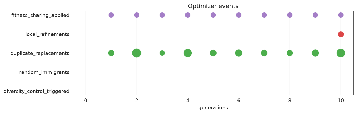
Each row is an intervention type; markers mark the generations where it fired.
What to look for: events bunched in the late generations usually mean the optimizer is fighting stagnation; an empty timeline means the search converged smoothly without needing diversity interventions.
Score Landscapes
plot_score_landscape highlights promising regions in a two-parameter slice.
plot_score_landscape(search, x="max_depth", y="min_samples_split")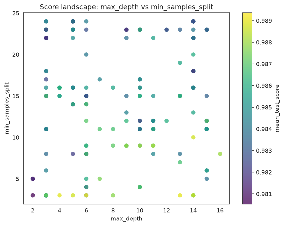
Scatter of evaluated candidates; color is the CV score, marker size encodes CV std.
Dense numeric spaces aggregate cleanly with hexbins:
plot_score_landscape(search, x="max_depth", y="min_samples_split", kind="hexbin")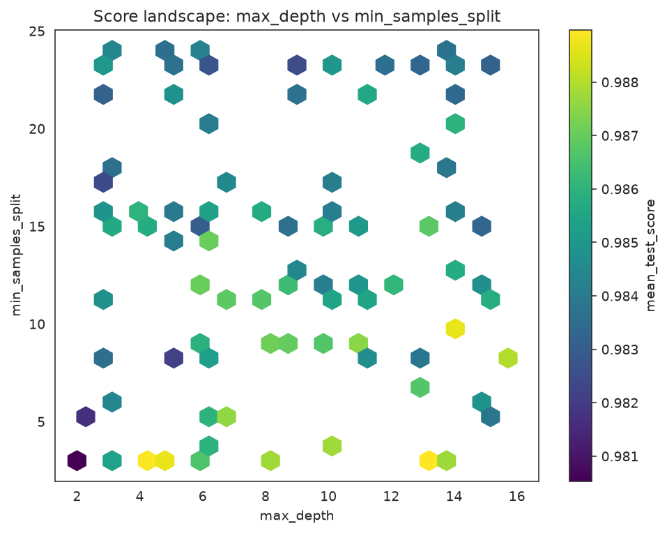
Hexbin aggregation of the same slice; each cell is the mean score of the candidates it contains.
What to look for: the brightest region is where the search found its best scores — a useful sanity check that best_params_ sits inside it rather than on a lonely edge point.
Candidate Rankings and CV Robustness
plot_candidate_rankings compares the top candidates with their mean score and CV standard deviation as error bars.
plot_candidate_rankings(search, top_k=8)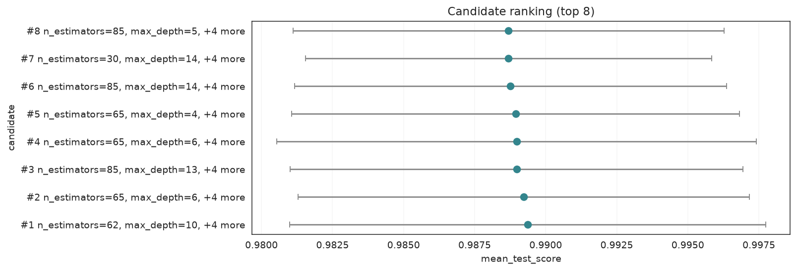
Top candidates ranked by mean CV score; horizontal bars are the CV standard deviation.
plot_cv_scores shows the fold-level scores for the strongest candidates so you can spot a winner that is not robust across splits.
plot_cv_scores(search, top_k=5)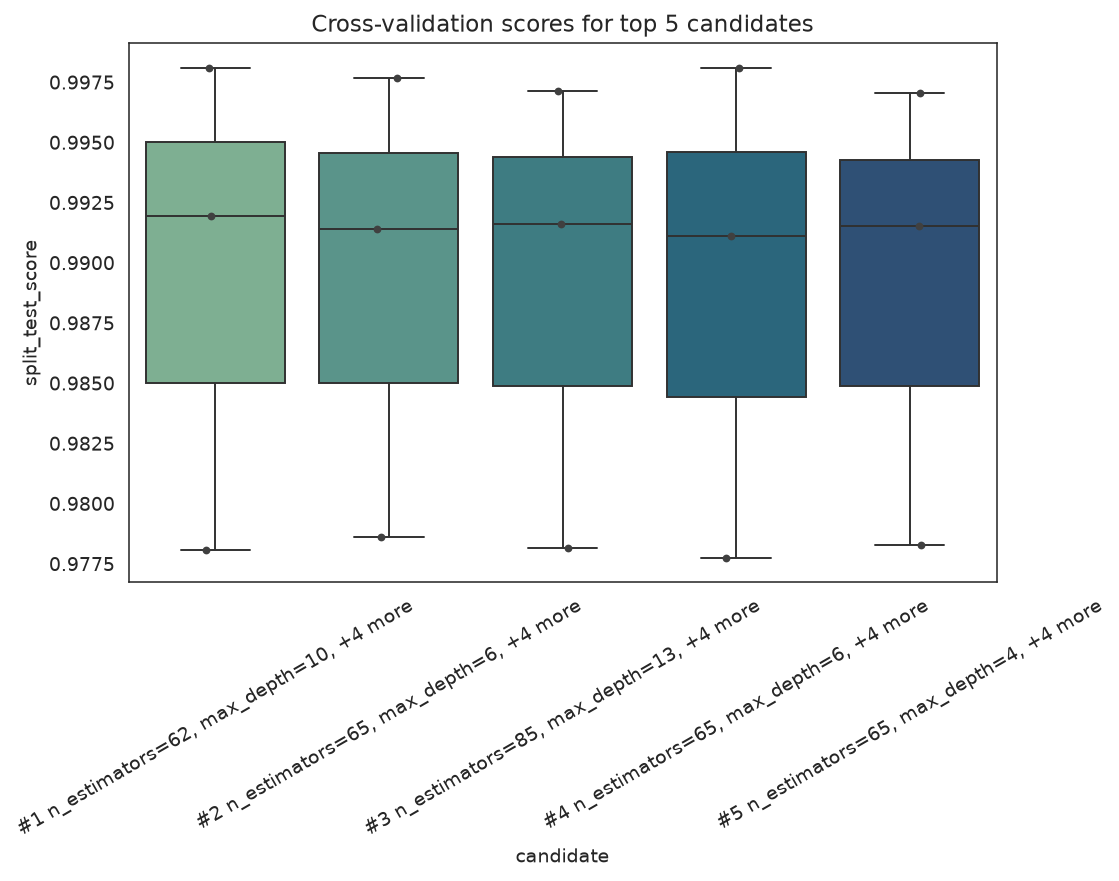
Per-fold scores for the top candidates; a wide box means a candidate is fragile across splits.
What to look for: prefer a candidate with a slightly lower mean but a tight fold distribution over a high-mean candidate whose folds are all over the place.
Feature-Selection Plots
plot_feature_selection draws the boolean support mask chosen by GAFeatureSelectionCV, and plot_search_overview swaps its candidate panel for that mask when given a feature-selection estimator. We run a small selection search on iris padded with noise columns.
from sklearn.datasets import load_iris
from sklearn.svm import SVC

from sklearn_genetic import GAFeatureSelectionCV
from sklearn_genetic.plots import plot_feature_selection

iris = load_iris()
X_fs, y_fs = iris.data, iris.target
rng = np.random.default_rng(42)
noise = rng.uniform(0, 10, size=(X_fs.shape[0], 6))
X_fs = np.hstack((X_fs, noise))
feature_names = list(iris.feature_names) + [f"noise_{i}" for i in range(noise.shape[1])]

selector = GAFeatureSelectionCV(
    estimator=SVC(gamma="auto"),
    random_state=RANDOM_STATE,
    cv=3,
    scoring="accuracy",
    population_size=12,
    generations=8,
    max_features=6,
    n_jobs=1,
)
selector.fit(X_fs, y_fs)
print("Selected", int(selector.best_features_.sum()), "of", len(feature_names), "features") gen evals avg best div unique stag mut sel events
---- ----- ------------- ------------- ------- ------- ----- ------- ----- ------------------
0 12 0.59389 0.91333 0.091 1.000 0 - - -
1 24 0.81333 0.91333 0.091 0.667 1 0.200 3 div,imm=3,dup=16
2 24 0.85000 0.91333 0.091 0.750 2 0.200 3 div,imm=3,dup=13
3 24 0.90889 0.96000 0.073 0.500 0 0.200 3 div,imm=3,dup=13
4 24 0.92667 0.96667 0.073 0.667 0 0.200 3 div,imm=3,dup=14
5 24 0.92944 0.96667 0.064 0.833 1 0.200 3 div,imm=3,dup=13
6 24 0.94222 0.96667 0.073 0.667 2 0.200 3 div,imm=3,dup=19
7 24 0.85111 0.96667 0.091 0.750 3 0.200 3 div,imm=3,dup=16
8 24 0.91333 0.96667 0.073 0.667 4 0.200 3 div,imm=3,dup=17
Selected 4 of 10 featuresplot_feature_selection(selector, feature_names=feature_names)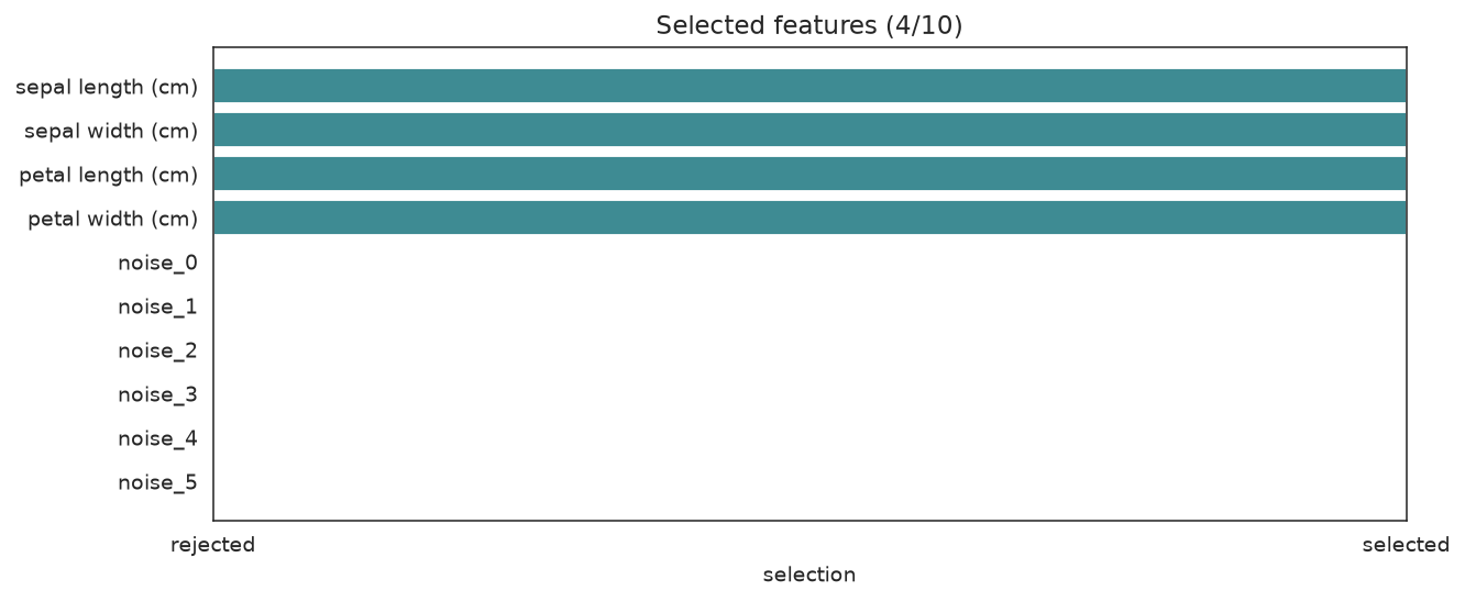
The four real iris features survive; most injected noise columns are rejected.
What to look for: the genuine features kept and the noise columns dropped.
plot_search_overview(selector)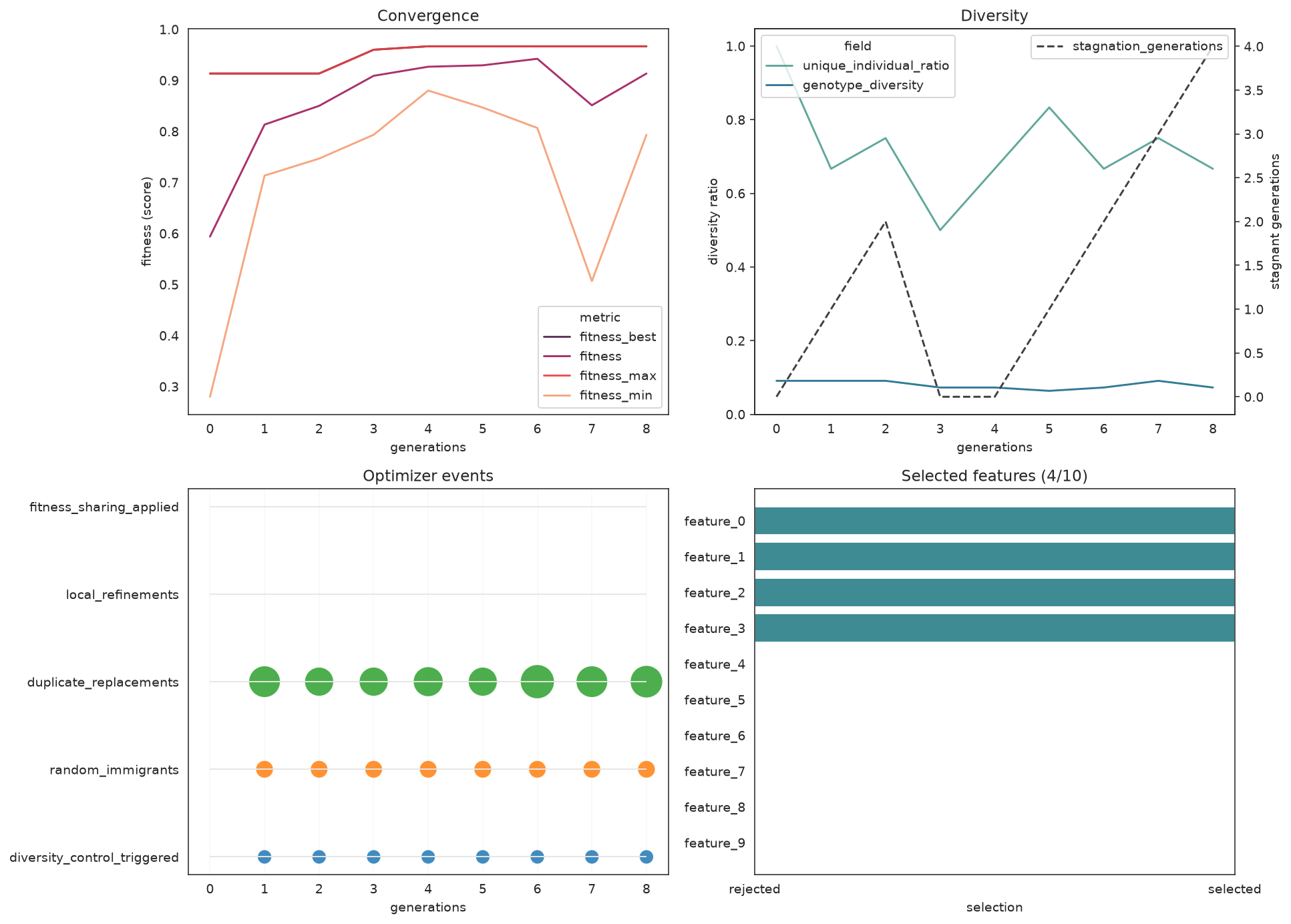
Same dashboard layout, but the candidate panel is replaced by the selected-feature mask.
Reading History Directly
Every plot reads from search.history. You can also work with it as a DataFrame for custom reporting.
history = pd.DataFrame(search.history)
telemetry_columns = [
    "gen",
    "fitness_best",
    "fitness",
    "fitness_max",
    "unique_individual_ratio",
    "genotype_diversity",
    "mutation_probability",
    "selection_pressure",
    "random_immigrants",
    "duplicate_replacements",
    "local_refinements",
]
available = [c for c in telemetry_columns if c in history.columns]
print(history[available].tail().to_string(index=False)) gen fitness_best fitness fitness_max unique_individual_ratio genotype_diversity mutation_probability selection_pressure random_immigrants duplicate_replacements local_refinements
6 0.988693 0.985227 0.988517 0.8 0.425926 0.1 3.0 0 4 0
7 0.988693 0.983945 0.984771 0.7 0.351852 0.1 3.0 0 3 0
8 0.989365 0.983538 0.989365 0.9 0.370370 0.1 3.0 0 2 0
9 0.989365 0.985164 0.988976 0.7 0.296296 0.1 3.0 0 4 0
10 0.989365 0.985648 0.988941 0.7 0.388889 0.1 3.0 0 7 2When to Use Each Plot
| Plot | Use when |
|---|---|
plot_search_overview | One-call diagnostic dashboard after .fit(...) |
SearchPlotter | Repeated diagnostics from a fitted search object |
plot_fitness_evolution | Quick fitness trend, optionally multi-metric |
plot_convergence | Fitness progress without event clutter |
plot_diversity | Checking diversity collapse and stagnation |
plot_history | Inspecting any telemetry field from history or logbook |
plot_search_decisions | Just the optimizer-control fields as step plots |
plot_search_space (pair) | Understanding parameter interactions |
plot_search_space (heatmap) | Spotting correlations between numeric params |
plot_parameter_evolution | How parameter values changed across evaluations |
plot_optimizer_events | Explaining interventions as a timeline |
plot_score_landscape | Finding promising parameter regions |
plot_candidate_rankings | Comparing top solutions with CV uncertainty |
plot_cv_scores | Checking fold-level robustness |
plot_feature_selection | Inspecting the selected support mask |
Practical Notes
- All plot helpers accept
ax=(and the dashboards takefigsize=) so you can compose them into your own figures. - The plots need
seaborninstalled — it ships as thesklearn-genetic-opt[all]extra. - If
plot_diversityshows an early collapse, reach forfitness_sharing,random_immigrants_fraction, anddiversity_controlbefore adding generations. plot_search_space,plot_score_landscape, andplot_parameter_evolutionareGASearchCV-only; the feature-selection estimator usesplot_feature_selectionand the overview dashboard instead.
See Also
- Plots API — full parameter reference for every plot function
- Feature Selection — the search behind the mask plots
- Advanced Optimizer Control — interpreting diversity and stagnation signals